Designed an 8-page trend report for ACI Speedpay titled “The Customer Choice Imperative: How Utilities Must Adapt to Payment Preferences.” The report presents key findings from the ACI Speedpay Pulse study, highlighting shifting consumer behaviors and expectations around utility bill payments. The design balances data visualization, modern typography, and branded elements to create a clean, engaging layout that communicates insights clearly while reinforcing ACI’s position as a leader in payment solutions.
Led the design of ACI Worldwide’s 90-page interactive Sustainability Report. Built as a fully navigable PDF, the report features embedded links, infographics, photography, and thoughtfully structured layouts to communicate key environmental, social, and governance initiatives. The design balances visual storytelling with data transparency, supporting ACI’s commitment to sustainability through a highly polished, user-friendly experience across digital platforms.
ACI Worldwide – Corporate Strategy Document (2023–2027)
Designed a two-page strategic overview for ACI Worldwide, aligning with corporate brand standards and visual identity. The layout was developed for both print and digital use, optimized for readability, executive presentation, and internal distribution. This piece highlights a clean, modern aesthetic with clear hierarchy, custom iconography, and branded data visualization to communicate high-level strategic initiatives with clarity and impact.
Project: For this graphic design project with ACI (a fintech company), I was contracted to create visually engaging layouts for a series of case study PDFs. The goal was to effectively showcase ACI's innovative solutions and success stories through a cohesive design that aligns with their branding. My role involved crafting an intuitive flow, selecting impactful imagery, and ensuring that each case study was both informative and aesthetically pleasing, ultimately enhancing ACI's presentation of their work to clients and stakeholders.
Project: For this graphic design project with ACI, I was contracted to create visually engaging layouts for a series of case study PDFs. The goal was to effectively showcase ACI's innovative solutions and success stories through a cohesive design that aligns with their branding. My role involved crafting an intuitive flow, selecting impactful imagery, and ensuring that each case study was both informative and aesthetically pleasing, ultimately enhancing ACI's presentation of their work to clients and stakeholders.
Project: For this graphic design project with ACI (a fintech company), I was contracted to create visually engaging layouts for a series of case study PDFs. The goal was to effectively showcase ACI's innovative solutions and success stories through a cohesive design that aligns with their branding. My role involved crafting an intuitive flow, selecting impactful imagery, and ensuring that each case study was both informative and aesthetically pleasing, ultimately enhancing ACI's presentation of their work to clients and stakeholders.
Created a marketing flyer for ACI Worldwide promoting their Chargeback Guarantee Service. The design clearly communicates key benefits around fraud protection and cost savings, using bold visuals, concise messaging, and branded graphic elements to engage financial institutions and merchants. Designed for both digital and print use, the layout balances attention-grabbing design with professional clarity.
Designed a promotional flyer for ACI Worldwide highlighting the benefits of accepting electronic payments through a client-funded, integrated treasury management solution. The layout emphasizes key value propositions with clean typography, branded visuals, and strategic use of color to guide the reader. Built for both digital distribution and print, the piece supports ACI’s outreach to financial institutions with a clear, modern design that reinforces trust and innovation.
Designed a flyer promoting ACI’s new Customer Communications Management solution, focused on helping clients build more profitable customer relationships. The layout combines strong messaging with clean visuals, using branded design elements to convey innovation and reliability. Created for both print and digital use, the piece delivers a clear, compelling overview of the platform’s benefits.
Designed a flyer showcasing ACI’s solution for simplifying payment reconciliation processes. The layout features a clean, organized design that highlights key benefits such as time savings, automation, and improved accuracy. Branded graphics and concise messaging work together to create a compelling, easy-to-digest piece for both print and digital distribution.
Designed a promotional flyer for ACI Worldwide spotlighting their Omni-Commerce™ payments solution for the hospitality industry. The layout communicates key benefits—flexibility, security, and global reach—through structured messaging, branded visuals, and a polished, hotel-focused aesthetic. Created for both print and digital use, the flyer helps position ACI as a trusted partner for seamless, guest-centered payment experiences.
Designed a detailed flyer for ACI Worldwide promoting their ReD Shield® fraud management solution for mobile operators and MVNOs. The layout highlights key capabilities—real-time fraud detection, improved acceptance rates, and expert-managed services—using structured content, clean typography, and branded visual elements. Created for digital and print use, the design effectively communicates complex functionality in an accessible, visually engaging format.
Designed a flyer for ACI Worldwide promoting their Service Fee Payments solution, part of the ACI Speedpay® platform. The layout clearly communicates how organizations can eliminate transaction fees while offering flexible, consumer-friendly payment options. With clean typography, intuitive structure, and branded graphics, the design supports both digital and print use—delivering key value points with clarity and impact.
Designed a promotional flyer for ACI Worldwide highlighting their self-service kiosk payment solution, part of the ACI Speedpay® platform. The design showcases the benefits of increasing customer convenience and operational efficiency through self-service technology. With a clean, accessible layout and branded visual elements, the flyer is optimized for both print and digital formats—clearly communicating how kiosks can streamline payments and enhance the user experience.
A postcard for physicians detailing the benefits of our product line and a QR code to learn more.
Project: A series of signs and promotional posters designed for Old Florida Bee Company
Logo design and branding for a prenatal nurse starting a Doula practice. Below is the style guide.
A logo design for the Dakin Family Scholarship Fund. In honor of the late Farren R. Dakin, the Dakin Family Scholarship Trust Fund Inc. awards TWO $2,000.00 scholarships every year to kids involved in the 4-H or a chapter of FFA in Manatee County.
A series of posters for a local Depressed Cake Shop pop up. All of the proceeds benefiting NAMI (National Alliance on Mental Illness). These were really fun posters to create and my client gave me total creative freedom!
Logo design for a very talented career and running coach. She wanted a logo with clean lines and incorporate the mountain laurel.
Healthy Body Acupuncture LLC came to me looking for a new brand. Dr.Karen Taylor had been practicing acupuncture for more then 18 years and wanted a new look to embody her personal style and approach to her clients. Below is some of the material I created for her.
Project: Update the Sovereign Silver line to include a kids line with characters, for a more youthful look and feel.
Sovereign Silver Kids line style guide and Kids logo lockup
Designed all Sell Sheets and templates for Sovereign Silvers Immune Support.
Designed Sell Sheets and templates for Sovereign Silvers KIDS line.
Designed Sell Sheet and Template for Sovereign Silvers Topical Gel line.
Designed a printed brand overview for our brokers and sales team to better explain the efficacy and effectiveness of our products.
Project: Create Sovereign Silver’s PETS logo, combining their classic logo and style guide for their PETS product line.
A Print and Digital Ad for Vitamin Retailer magazine to introduce the new KIDS line for Sovereign Silver.
Designed all sell sheets for Sovereign Silvers PETS immune support line. A new line of products dedicated to the overall health of your pets.
Designed a sell sheet for the new trial and travel 3 piece set immune support set. TSA approved and perfect for flying.
Created an ad for Sovereign Silvers product lines and to promote their new PETS line.
A large format display header for select Vitamin Retail Shops.
This is a established construction company that was looking for a fresh logo and new branding material. It has been a pleasure creating their new logo and all print material to go with it. Below is their new logo, brand board/ style guide, business card layout and letterhead.
Designed Sell Sheets for the PETS Topical healing line. A new product to help heal your pets cuts, rash, paw burn and more.
Created this logo and brand for a Florida Captain. We worked together to create the look and feel that he was going for.
Brand Board featured below.
This is a logo I created for a local Wellness center opening in St.Petersburg Florida. They wanted a coastal modern feel with a clean sans serif type face.
Brand board is featured below
MS-IL, a staffing and talent company that wanted a different look for their print sell sheets and overall print collateral.
The blueprint house is actually a drawing I created based off of their corporate office in Indianapolis. They are progressive, innovative and a great client to work with.
Illustrations of owls I created to be placed on products.
This logo and brand board was created for Society Of Product Safety Professionals. A non for profit that supports professionals in leadership service to the consumer product safety field.
To find out more about their organization or become a member, please go to:
This logo and these patterns were made for a candle company based out of NYC.
The patterns were for their box and tissue paper design.
This logo was designed for a unique company. The U is to hold your eye glasses in place while wearing a beautiful necklace.
The patented U shape makes it very easy to slide your glasses into place using only one hand. U-Loop elegantly blends functionality with beauty in the form of a stylish piece of jewelry that can compliment any outfit!
To find out more please go to:
Illustration created for a local temple
Project: A fun logo collaboration with my friend and great artist Brendan Coudal. We collaborated together to make this logo unique to a local captain in Sarasota, FL.
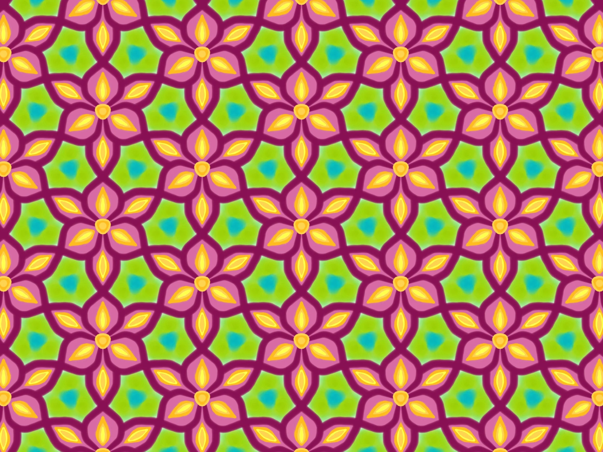
Hand drawn pattern and surface deigns.
This concept came up because SYS wanted to have an annual report to show donors and make it a lasting, memorable piece. I came up with the idea of making it a year book so while looking at all their financials it also tells a story to the donors of where exactly their contributions went. It was a huge hit and the kids took a copy to have as a memory of this year.
This Out Of The Blue logo and Campaign was created for our local NAMI chapter. They wanted a updated look for this years Out Of The Blue fund raiser. This is now an annual event to raise funds for our local chapter. This event enables NAMI Sarasota County to continue to provide their peer and family support groups and education classes and expand these programs to meet the growing need in our community.
To the left: Campaign Logo, Flyer, and Event Program
Featured In Cosmopolitan Magazine!
This tarot deck was illustrated by good friend and Brooklyn living artist Stefanie Caponi. I took her gorgeous art and helped make it into the deck it is today. Collaborations are always a thrill and this deck is proof of that. The deck is currently being sold online and in stores across the country. We are featured in the Cosmopolitan Magazine December 2019 issue!
To purchase a deck please go to:
Patterns were created for a series of products.
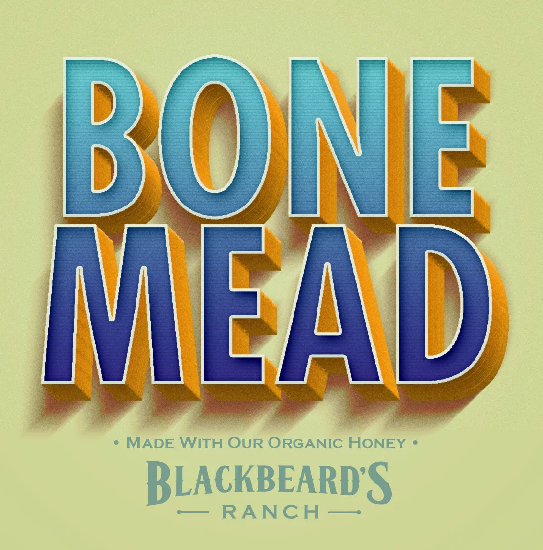
Project: Create a beer label for Blackbeard’s Ranch seasonal Mead.
This is a company based out of Germany and Slovakia that is the world leading cryogenics company. I had the pleasure of rebranding them and creating their new print collateral. To find out more visit their site